

Over the past ten years, we’ve been constantly improving the way we write code at Graffino, but I must admit, we just didn’t consider accessibility when we started. Later on, we had the opportunity to work for a client that needed accessibility as a default for its product. We were ashamed to realize, what we usually delivered wasn’t quite up to standards.
A lot of developers think that, by implementing blindly ARIA properties everywhere, they will make their site accessible for disabled visitors, when in fact a lot of the spec isn’t properly supported or documented, thus making their site less accessible.
This is why we decided to write this article, which will be part of a series of articles on web accessibility, which we will write in the future.
With designers and developers quick to jump on to the next best technology, accessibility best practices and principles are overlooked, so users with disabilities are often left behind.
And it’s easy to see why.
Under the pressure of shorter deadlines and higher and more demanding standards from clients, oftentimes in competition with other companies promising to deliver faster and better products, designing for users with disabilities will add more to an already high workload. And let’s be honest, most of us don’t always feel like doing more if we can get away with less. But designing with accessibility in mind doesn’t have to be all that hard.
What is Accessibility and Why Should We Care?
Web accessibility means creating designs, apps and content that almost any individual can use, including those who have visual, auditory, motor, and cognitive disabilities or various other impairments.
When most of us think about a better web, top-notch technologies, outstanding visuals and sublime animations are what comes to mind. But how many among us are struggling with certain disabilities that make them incapable of seeing or interacting with the web in the way we think they should?
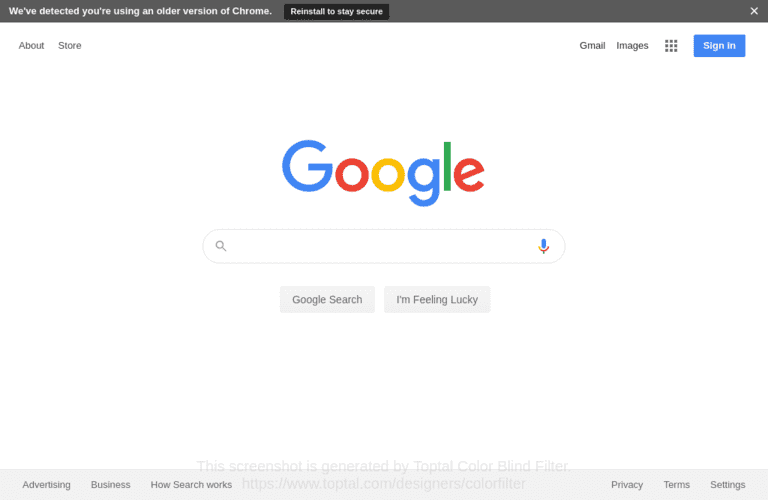
Imagine for a moment that you suffered from color blindness. You can’t fully see the red and the green — which is the most common affection of color-blind users. What that means is that you won’t be able to distinguish certain colors that contain red and green wavelengths, making it hard to choose between something like a purple — which contains red — and a shade of blue. Or see the pink in a funky design — it’ll come off as some sort of washed-out yellow.
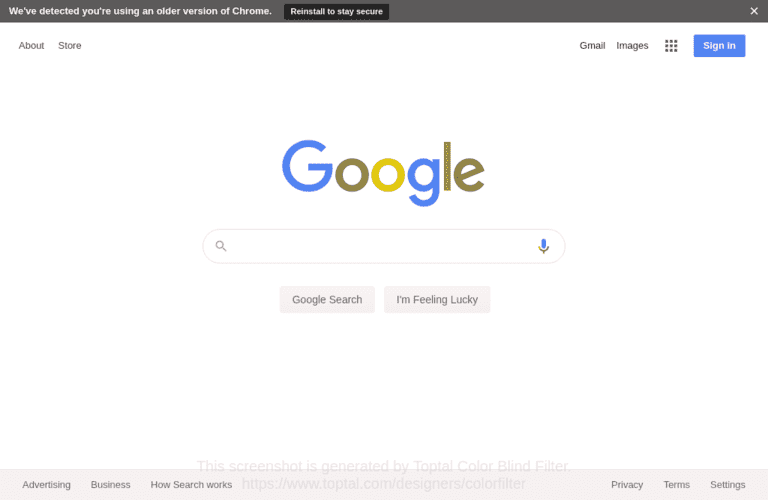
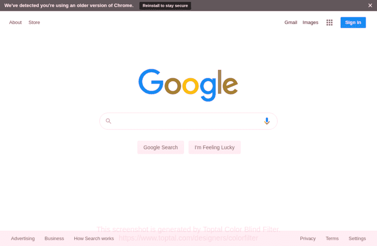
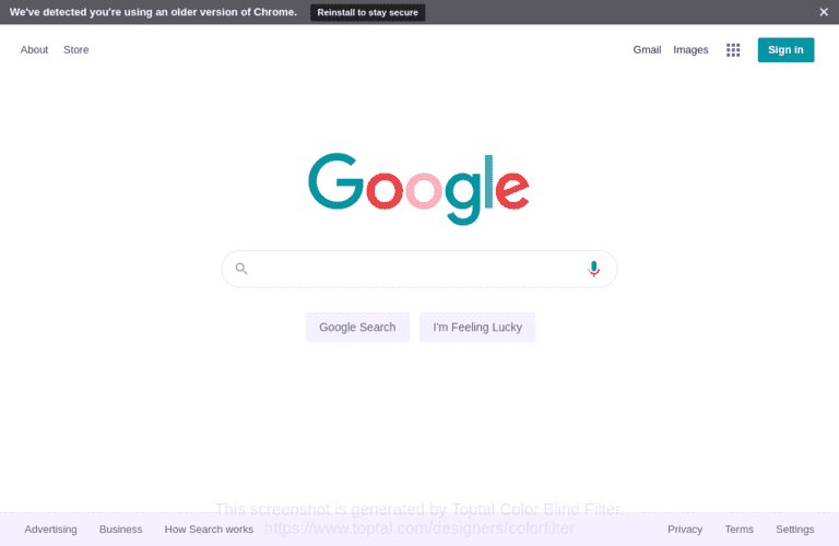
In general, those who suffer from a moderate form of red/green color blindness can identify around 5 colors from a standard box of 24 pencil crayons. These are all people who might not enjoy that superb color palette you chose for your latest project.
Since the web is a visual environment, a big and quite common issue are background and foreground color combinations which make web pages unreadable for color-blind users.
You’d be surprised to find out that 1 in 12 men and 1 in 200 women have a certain degree and type of color blindness.
And color blindness is only one type of problem.
What do Studies and Statistics Have to Say
The World Health Organization (WHO) estimates that there are over 217 million people who suffer from moderate to severe vision impairment.
Now count in all the people with other problems. Deaf or with hearing problems, those who suffer from dyslexia, autistic spectrum or photosensitive epilepsy. Some have manual dexterity problems and various other motor disabilities. There are also: anxiety, learning disabilities and the elderly who suffer from various impairments caused by advanced age.
The Click-Away Pound Survey made in UK in 2016 about customers of e-commerce sites, found out that there are around 6.1 million disabled internet users with special accessibility needs in the UK alone. Most of these people will spend their money on websites that have the fewest barriers in their way. Over 71 percent of them will click away from a website which they find difficult to use.
The biggest issue are pages crowded with too much content. Then come poor link information and navigation, forms with a bad design, distracting moving images and graphics and poor legibility — bad color contrast and text layout.
In the United States, there are over 56 million people who have a certain disability. That means approximately 1 in 6 individuals. Another report from the World Health Organization (WHO) tells that worldwide, there are over 1 billion people who live with some form of disability, which amounts for 15 percent of the world’s population.
That makes for quite a significant number of web users who can’t see and interact with the online world in the way we think they should. And 9 out of 10 of them don’t even bother to complain about website accessibility problems. Which makes website owners unaware of the potential users or customers they lose.
Better Web Accessibility Benefits Us All
Designing with accessibility in mind can actually foster innovation. The limitations it imposes on the design and development process can make things better for everyone.
It’s a known fact by now that constraints and limitations actually boost your creativity rather than hinder it.
What’s more, accessibility shouldn’t add a lot more work to do if it’s done from the start. Sure, fixing a website that doesn’t have accessibility features already implemented will require some effort. Starting from scratch with this in mind should make things easier.
But the greatest thing about making digital content accessible is that it creates a better experience for everyone, even to those with no disability at all. From power users and young people to users with disabilities or elderly people, everyone will have a quality experience.
Also, there are studies that show that accessible websites rank better for SEO and in search results, amass a bigger audience, have faster download times and better usability. They also inspire developers to improve their coding practices and become better at what they do.
The Do’s and Don’ts on Designing for Accessibility
The best and most beneficial approach when creating digital content with accessibility in mind should be creating it in collaboration with communities of people with disabilities. They are the ones who create true life-hacks when it comes to their impairments.
They might actually come up with very creative solutions to specific design challenges, which are usually a more obvious version of the ones faced by non-disabled users.
In real life though, that’s something few individuals or companies are willing or at least afford to do, so knowing the do’s and don’ts of accessibility should at least be on their minds.
1. Designing for Users with Low Vision
We’ve already talked about what some users with visual impairments can suffer from. Now let’s see how designing with accessibility in mind can help make things better for them.
Avoiding low color contrast is one of the most important things, as it’s often overlooked. Having good color contrast allows users with low vision — and even those without issues, but with tired and sore eyes — read text from a background color with ease. Low contrast makes it almost impossible for some users to distinguish one color from another or even the text from the background.
The World Wide Web Consortium (W3C) has several criteria when it comes to the minimum contrast ratio between the text and the background — at least 4.5 to 1. Fonts and sizes have a great impact as well, with heavier and larger fonts being easier to read at lower contrast. There are several tools available among which WebAIM’s contrast checker is a good option. For Mac users, there’s also the Contrast app.
For a thorough check of the color combinations of all DOM elements on a website, you can usea Check My Colours, which will give you a report of all the bad spots.
Buttons and notifications should be put in context rather than having actions separated from the content.
Color and color differences shouldn’t be the only means to convey critical information on a website.
Take error messages for example. A combination of text, shapes/icons and colors should be used instead. Designing for color-blind users should be made according to WCAG guidelines, and a helpful tool for that is Colorsafe.
Trello’s color-blind mode is also a good example here.
Additionally, all the important information should be available on the website rather than buried deep into files available for download only. Content should also follow a linear and logical layout rather than spread all over the page in a messy manner.
2. Designing for users of Screen Readers
The 2016 Click-Away Pound Survey we mentioned above found out that over half of those who participated in the survey used some form of assistive technology (AT) to help them interact with computers. Screen readers represented 58 percent of all, followed by screen magnifiers, dictation software, and refresh-able braille.
While these technologies help visually impaired users, website design plays a key role in how well these devices function.
That’s why it’s important to structure content by using correct markup, and not rely on text size or placement to give the structure of the page. Websites should be built for keyboard use also, without forcing mouse or screen use only. Links and headings should be descriptive and not uninformative.
The alternative text for images or other non-text content should always be used. Though many people know about it, there are plenty of websites with no alt attributes on their images.
We all know how ugly the default browser focus indicators can be so we are usually tempted to remove them. But things shouldn’t end there. Designing usable focus states, which are both very visible and with good contrast is possible and should be the norm. For more info, you can check out this W3C document about visible focus states.
3. Designing for users with Physical or Motor Disabilities
While the web is a visual environment, that doesn’t mean that users with physical or motor disabilities won’t have a hard time accessing it.
Physical or motor disabilities can have a negative influence on using a mouse, touch screens or the keyboard. That’s why a website should be designed for keyboard operation or speech-only use and also with touchscreens in mind.
Keyboard navigation, for example, is one of the most critical aspects of web accessibility. Not only people with motor disabilities or those relying on screen readers need it, but also power users who often make use of keyboard shortcuts for faster navigation.
It’s important to provide shortcuts and not force users with lots of typing, or force too much and too complex mouse movements. The clickable sections should be large and not demand precision. Also, developers and designers should avoid creating long and complex menus.
4. Designing for users who are Deaf or hard of hearing
More and more content on today’s web comes under the form of audio. Think about podcasts and videos. Providing transcripts or subtitles is very important for users with hearing impairments.
Allowing those users to choose their preferred means of communication support is also of importance. Think about booking various services or using support for example.
The content should be broken up to make well use of text, images and videos, blended to create meaningful, logical and easy to consume content.
Forcing users to read long blocks of text is the way to lose them in the long term.
5. Designing for Users on the Autistic Spectrum
Autism Spectrum Disorders (ASD) is a range of mental disorders that includes what’s usually known as autism and other issues such as the Asperger syndrome. Reports from 2015 showed that one percent of the global population — over 60 million people — suffers from one syndrome in the Autism Spectrum.
People suffering from these disorders have trouble performing daily tasks, maintaining their jobs or keeping normal relationships. They can respond in abnormal ways to sensations like sights and sounds, which is a concern in the case of the web. They also have a slow development of learning skills, which again affects their ability to use complex websites.
When designing with these kinds of users in mind, it’s important to avoid bright colors and use a simple color palette instead. Writing in plain language and avoiding figures of speech and idioms is also recommended.
Buttons, form fields or similar elements should be descriptive, not vague and unpredictable. The layout should be simple and consistent because a cluttered and complex layout would be impractical. Simple sentences and bullets always win over huge chunks of text. That’s important even to normal users.
6. Designing for users with Anxiety Disorders
While anxiety is a normal human emotion, anxiety disorders are a different thing. They are defined as mental illnesses, which prevent one from living a normal life. Worry and fear are constant in their life. Panic attacks, phobias, and various social and general disorders can appear out of the blue in ordinary situations.
For a user with some form of anxiety disorder, it’s important to give him or her time to complete an action or fill in a form, without rushing them with timeout limits. It’s important to give clear explanations on what’s happening and reduce confusion about what the next step is.
It’s equally important to give users easy access to support when they need it without hiding it or making it hard to access. Also, allowing users to check their answers before submitting them is good practice. Leaving them questioning their answers will make them prone to anxiety hitting.
7. Designing for users with Dyslexia
Dyslexia, also known as reading disorder, is a learning disorder that affects one’s ability to read — the most common, spell, write and speak. Caused by both genetic and environmental factors, dyslexia affects between 5 and 10 percent of the American population, both young and adult.
Therefore, it’s important to keep text properly aligned to the left, keeping a consistent layout and avoid underlining non-links, using italics or writing in capital letters.
Images and diagrams should support the written content, as large blocks of heavy text won’t help anyone. The content should be short, clear and simple and rely on accurate spelling. Using auto-correct or providing suggestions is also recommended. Forcing users to remember things from other pages isn’t a good practice either, so this should be considered as well.
It’s Easier if You Think Disability First
Good coding practices can easily include designing for users with disabilities and it doesn’t have to take too much extra time if you start with it in the first place.
The limitations this design imposes doesn’t mean the end result should be ugly. Elegant design that works is possible, without sacrificing aesthetics for function or vice versa.
What’s more, throughout the world, talks about legislation related to web accessibility are taking place, and a future where designing for better web accessibility is not only morally correct but also a legal obligation is not too far away.
Resources and Links
Stats
- Blindness and Visual Impairment
- Wordpress Accessibility Handbook — Tools
- The Click-Away Pound Survey 2016
- Autism Spectrum Disorders (ASD)